
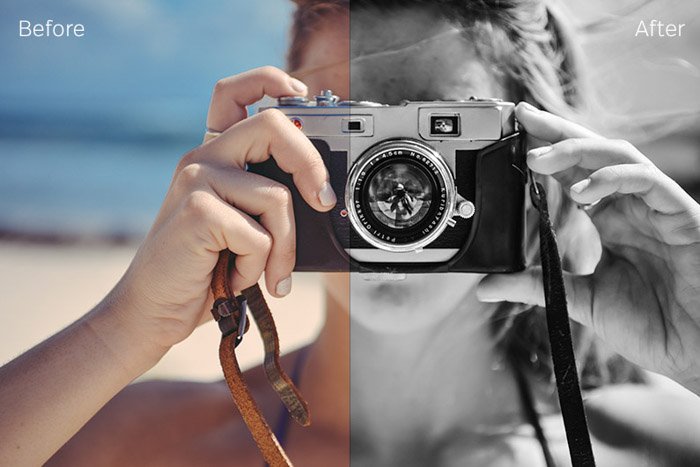
After a quick search on Google, you’ll be flooded with thousands of free Lightroom presets. Some can be very expensive, while others are free. Some are great, some are okay, and the rest are probably not worth using.
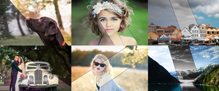
Presets are a great way to work through your images in Adobe Lightroom. They are adjustments made to an image and then saved for future use. Some photographers or software manufacturers create these presets. And they offer them to the world. Here, we have collected 37 free Lightroom presets covering most photography topics.
Free Lightroom Presets: Why Use Them?
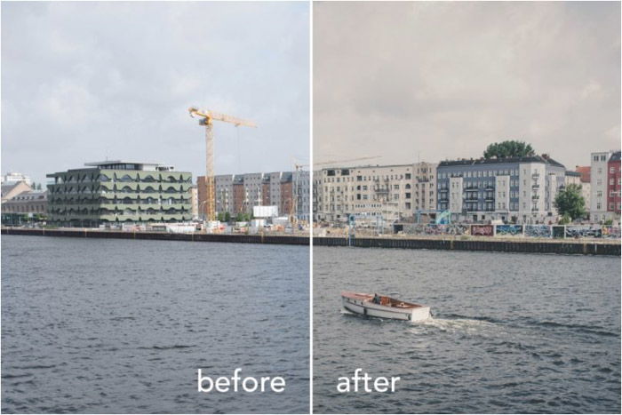
Lightroom presets are for speeding up your post-processing. They allow you to edit more images simultaneously with a single click. This way, your images can have a uniform tone and atmosphere. All you need to do is paste the settings to all your photos.
It’s perfect when you have a deadline to meet. For example, event photographers almost always use presets.
Everyone can benefit from using Lightroom presets because they are non-destructive. Editing in Lightroom is non-destructive. This means you can always go back to the RAW image at a click of a button. You can remove your adjustments easily.
You might add pre-made adjustments to your image, but these can all be tweaked for a personal look. This also hastens your workflow and, at the same time, teaches you how you can reach different effects.
You can easily install presets in Lightroom and then easily use them. After that, import your images and start working. Plus, it’s great when you can do it for free!
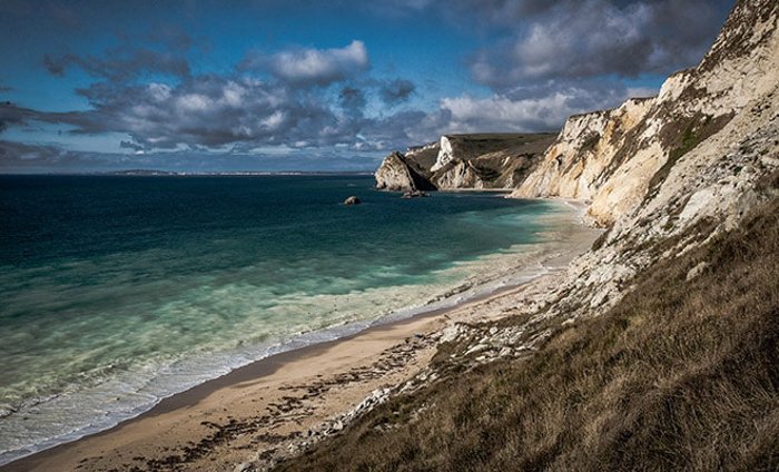
Free Lightroom Presets for Landscape Photography
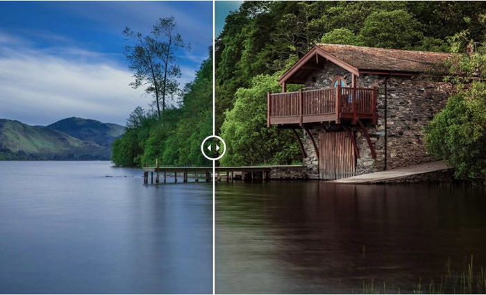
Landscape images can really benefit from Lightroom presets. Green rolling hills, a mountain in the background, or a water source. Your photo most likely has one or more of these elements.
The following presets help bring out colors. They also bring down the highlights and bring detail out of the shadows. This helps your hills, mountains, rivers, etc., pop!
1. Beautiful Sunrise
When there isn’t enough light yet, colors can appear plain.
So this free Lightroom preset from PresetPro helps you enhance the magical colors of every sunrise.
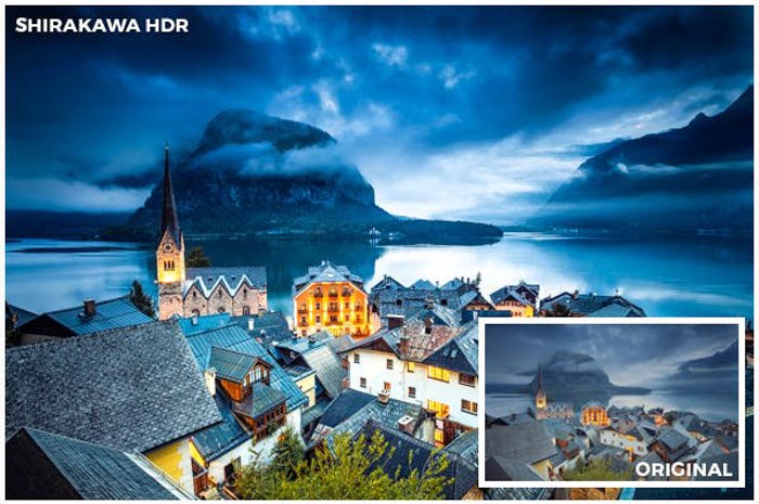
2. Cinematic HDR
This free Lightroom preset from Loaded Landscapes gives your landscapes a unique cinema-inspired HDR look.
It may look unnatural on some of your images, but you can experiment by trying it on different types of images. Just look for a good fit.
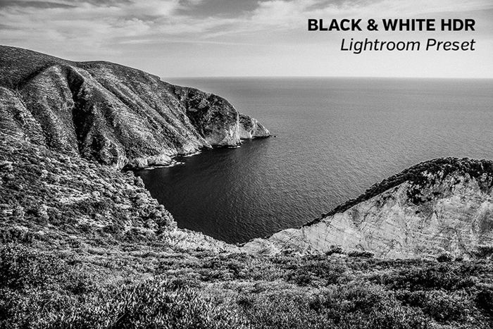
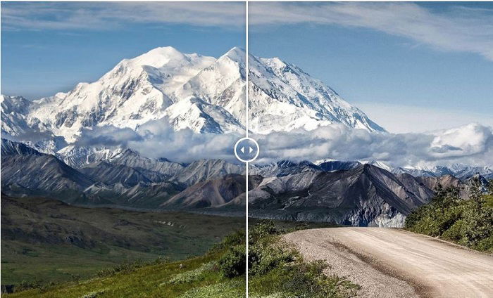
3. Black and White (B&W) HDR
Sometimes your landscape images look great in black and white. A touch of HDR can even make them more dramatic.
This Loaded Landscapes preset also looks good with other genres, not only landscapes. So we suggest you experiment with it.
4. PRO Landscape and Travel Lightroom Presets
This is a BeArt Powerful Collection for travel and landscape photographers. You can get 15 free Lightroom presets with just one click.
Using the same preset on several photos can add another dimension to your personal style. It also makes those images look like they belong together.
5. Rising Star
This free preset from Shutter Pulse on Loaded Landscapes will add a cinematic look to your photos.
It strengthens the contrast and broadens the dynamic range. This way, you can enhance the power of nature.
6. Landscape
Photonify created this landscape preset. Their preset adds contrast to the midtones. The exposure is lightened, and details are pulled out of the shadows.
These adjustments deepen the colors. And they turn images into something more powerful without looking too artificial.
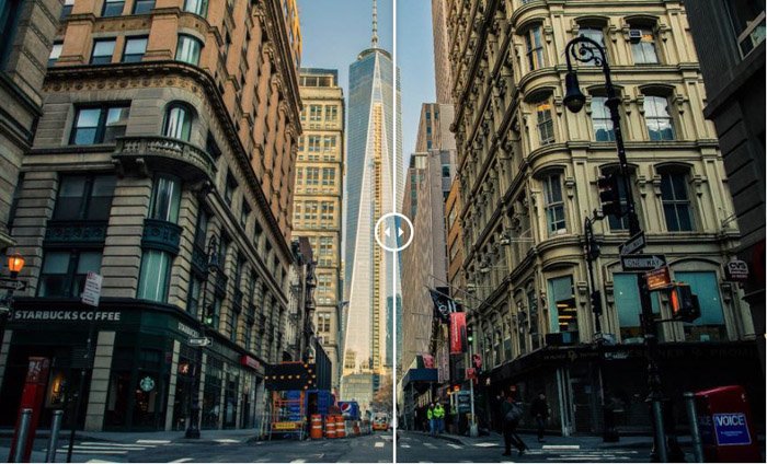
Free Lightroom Presets for Street Photography
Street photography presets are a great way to go through hundreds of photos in one fell swoop. Since you’re photographing many subjects, from people and architecture to daily life, you need something just as versatile.
Here is a selection of street photography presets to make your images bloom.
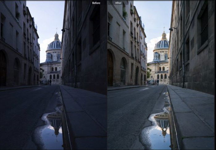
7. Street View
This free presets called Street View was created by Presetpro.com.
This Lightroom preset’s task is to bring out the details, especially in high-lit areas such as the sky. The whole image gets an extra notch of brightness and a warmer feeling.
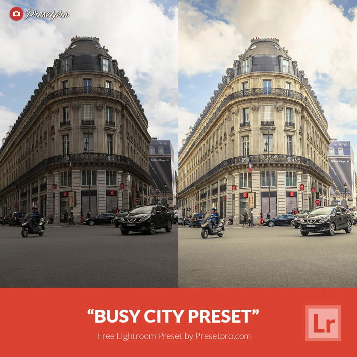
8. Busy City
Busy City was also created by Presetspro.com, which brought us the street view (above).
This Lightroom preset adds an exposure increase to your image and adds detail to high-lit areas like clouds. It makes the photo pop and be more interesting, even if your original image was a little drab and muddy.
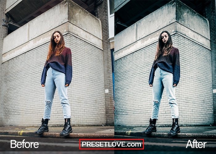
9. Street Blue
The website Preset Love offers this industrial Lightroom preset called Street Blue.
It draws out deep and moody hues suitable for street photography portraits and scenes. If you want to bring out textures and details, be sure to try out this preset.
10. Eric Kim Lightroom Presets
These free presets by Eric Kim can make your street photos edgier.
There is a monochromatic and a color version available. Both of them are high-contrast presets. They make some details disappear from your photos. And this emphasizes the shadows and figures.
Free Lightroom Presets for Portraits
Portraiture, fashion, and boudoir focus on the person rather than the setting. Curved shapes and expressions make them powerful.
Lightroom presets can help with the image’s exposure, mood, and tone. They can add to the feeling or juxtapose it. The outcome is down to you.
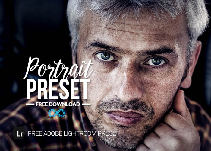
11. Portrait Preset
This free Portrait Preset from Photonify makes your images sharper and grittier.
It’s not always a good idea to enhance the skin’s structure this much. But there are images where it fits perfectly and makes them more dramatic and characteristic.
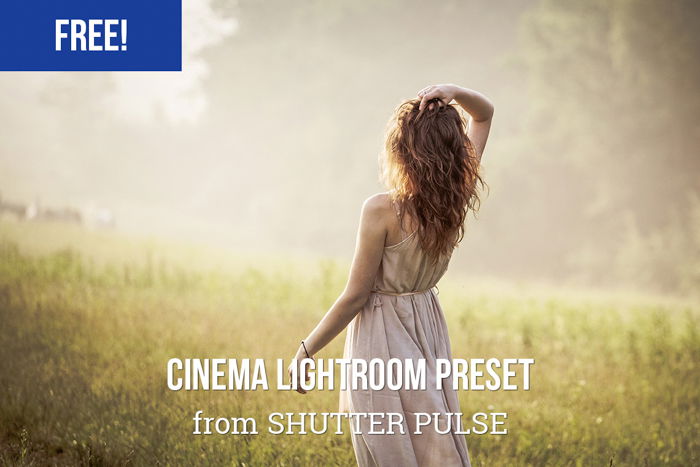
12. Cinema Lightroom Preset
You can get 20 free Lightroom presets from Shutter Pulse.
These will make your portraits more artistic by giving them a cinematic atmosphere.
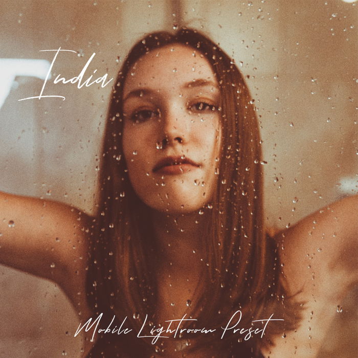
13. Free Lightroom Mobile Presets
Imaginated (previously Preset Galore) offers free Lightroom presets for your smartphone.
These are perfect for editing your images on the go. They save you a lot of time and enable you to immediately post on your social media.
14. Monochrome
This free preset by Photonify is a black-and-white conversion. It looks great and doesn’t change the overall image too much.
The highlights and whites shift downwards. Whereas the clarity, shadows, and blacks are pushed upwards. Your photos will benefit from this vintage preset. It will save you a lot of tinkering.
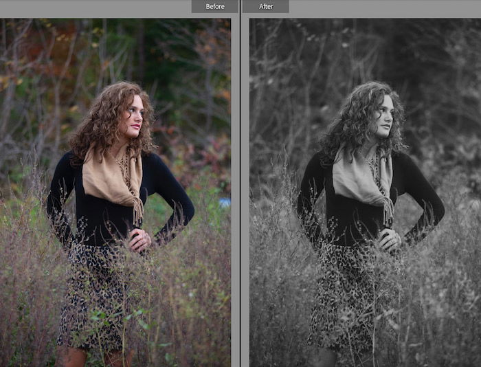
15. Shadowze
This black-and-white Lightroom preset was created and shared by Lightroom Look.
It is a great preset for converting color images to black and white. It flattens out color images but ensures a nice contrast between dark and light shadows. This ensures a subtle pop.
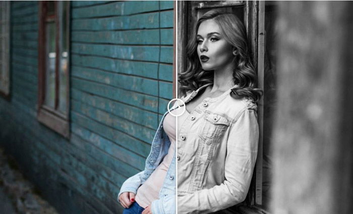
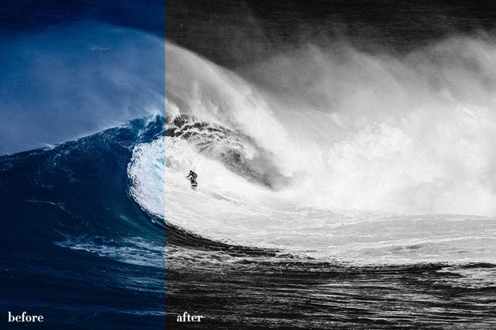
16. High Contrast B&W
This preset is one of our favorites. It offers high contrast for portraits, street photos, and landscapes. All may benefit from this black-and-white conversion.
The contrast is what makes them pop. It adds a mysterious tone to the image and drops distracting, small details.
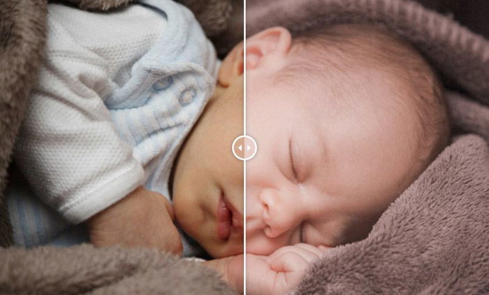
Free Lightroom Presets for Newborn Photography
When it comes to family photos, you want something warm, pleasing, and filled with happy emotions.
Baby photography embodies these qualities with an added “aww” factor. This “fuzzy feeling” is achieved using a preset like the ones below.
17. Newborn
This preset by Photonify brings down vibrancy and clarity. This softens the mid-tone contrast and helps the subject blend more into the setting.
It adds a yellow temperature to the image to make it warmer. The shadows and blacks have also been muted, so the image is much softer.
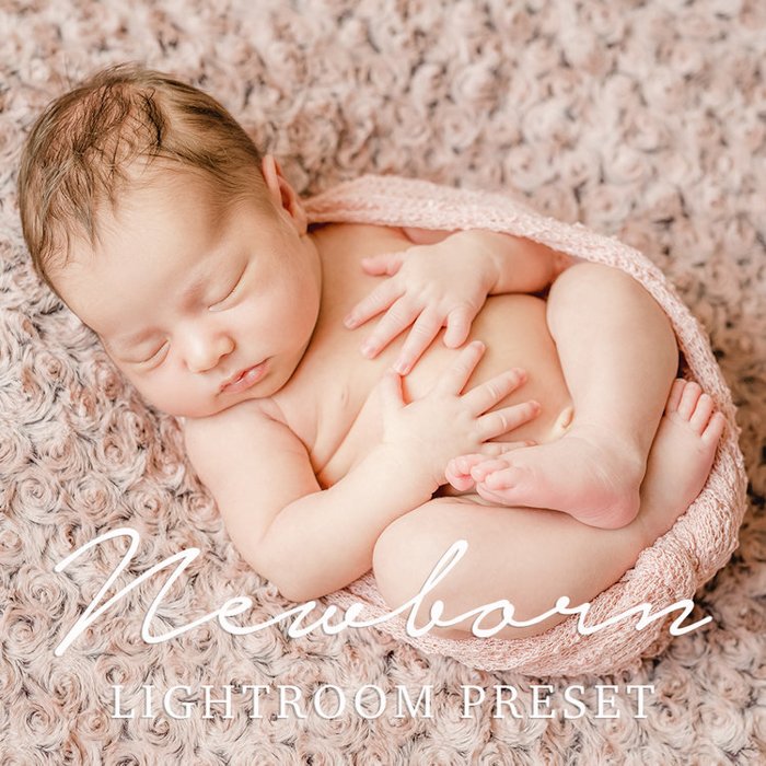
18. Newborn Baby
You can also use this BeArt preset on your computer and Lightroom mobile.
It gives your images a warm and soft atmosphere. So you can photograph your child and immediately send beautiful images to your relatives.
19. Newborn Lightroom Presets: Portrait Lightroom Presets
Here, you can find 20 free Lightroom presets by TemaPhoto on Envato Elements for newborn photography.
You can use them for portraiture as well. These are especially great when you do a photo shoot of a newborn and the whole family. You’ll definitely find something for all of your images.
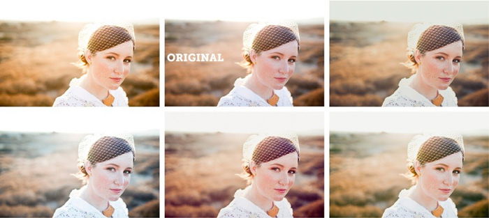
Free Lightroom Presets for Wedding Photography
If you are a wedding photographer, there is a high chance that you will take hundreds of pictures in one day.
This is why it’s beneficial to use Lightroom presets. You can significantly make your post-processing faster with presets.
Of course, you are going to have to adjust them a bit. Usually, a wedding happens in multiple venues and varying lighting conditions. But it’s a good start to try Lightroom presets, which fit the atmosphere of a wedding.
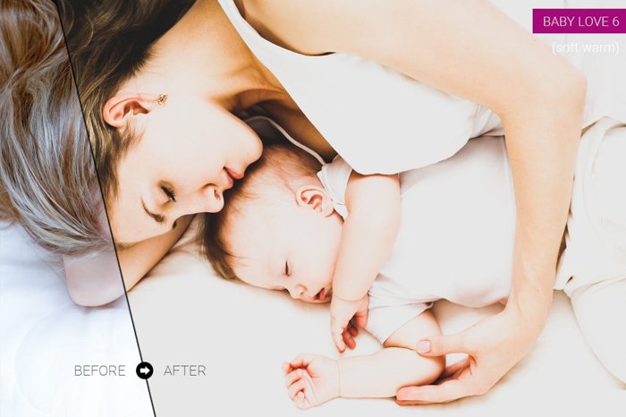
20. Mini Enlighten Presets
These free Lightroom presets from MCP can be used for different genres of photography.
On your wedding images, they will look soft and warm. They add a bit of yellow to the images making the bridal dress look stunningly white.
21. Super Preset Sample Pack
These 10 free Lightroom presets can make your wedding photos stunning. This collection contains five color presets and five black-and-white presets.
You can decide what kind of effect you wish to reach with your images and choose a preset with that in mind. You’ll find everything from warm and romantic tones to more dramatic monochrome.
22. Presets for Portrait, Weddings, and Film
These are 12 of the best free Lightroom presets from Greater Than Gatsby. As you can see, this package contains free Lightroom presets for wedding photography.
But don’t hesitate to try their other products on your wedding images. You can get great results from them too.
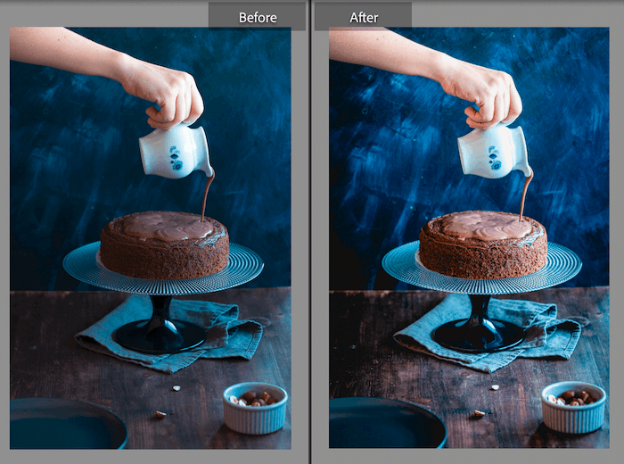
Free Lightroom Presets for Food Photography
In food photography, it’s important to find balance during post-processing. You want to make the food look delicious. For example, sometimes, you must saturate your images to make the fruits look appetizing.
But generally, we recommend looking for a rather natural effect. You don’t want the food to look like it’s made of plastic!
23. Dani’s Cookings
These free presets from Daniela Lambova will enhance your food photography.
It was made for food images with low contrast or highlights. She has made ones specifically for specific deserts. And others bring out light tones or blue highlights with smaller adjustments.
As you can see, they are not overly dramatic presets. But they make your food stand out a bit more.
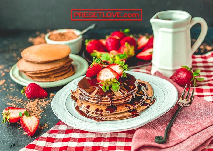
24. Food
This is a free option from PresetLove. It was made to make your food photos more colorful and exciting.
It’s perfect for sharing images on social media. Your photos will pique people’s interest and stop them from scrolling past.
Free Lightroom Presets for Night and Astrophotography
Night and astrophotography landscapes benefit from presets… in a more serious way than those adjusting images of babies and families.
These presets help dehaze images caused by light pollution.
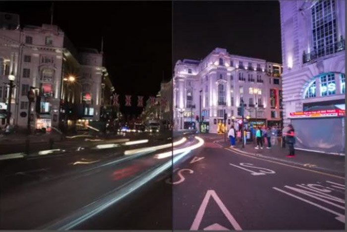
25. City at Night
PresetPro has our first choice for a free night photography preset. They increase the exposure while keeping the highlights down.
The details are pulled from shadows, and the contrast is present but not overly used. It’s great for street scenes with lots of light sources.
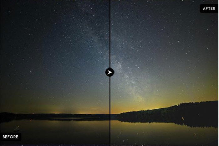
26. Astro Photography
These three presets can really bring out the best in your astrophotography:
- The first preset adds clarity and highlights to make those lights pop.
- The second preset is more muted and not so strong as it subtly increases the detail in the shadows.
- The third adds warmth to the yellow color temperature and light through exposure, whites, and highlights.
Free Lightroom Presets for Travel Photography
Travel photography is one of those all-encompassing photo niches. You’ll take different shots on your travels, be it architecture, portraits, or landscapes.
So you need some presets that are just as versatile. Here are three free Lightroom presets. They will work well with your nomadic travel images.
27. Travel by Nomanbefore
Here are four presets to cover all travel bases:
- Laguna Sunset: Brings details out of shadows and increases the highlights, adding a warmer tone.
- It’s a Jungle Out There: Adds exposure while keeping the contrast low for a warm, light photo.
- Into The Woods: Adds warmth and light to make a forest warm and welcoming.
- Beach Days: Brings out the best of the light and mutes the distractions in the image.
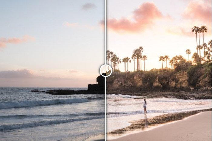
28. Travel Presets
These are Lightroom presets by FilterGrade (via Loaded Landscapes). They help turn those muddy, cold images into something more powerful.
They add warmth and take away that blue tinge of coldness. These can subtly bring out the best in your travel photo while keeping them professional.
29. Travel by Photonify
This preset offers warmth, contrast, and highlights. The adjustments here involve upping clarity and vibrance while keeping saturation low.
This allows a punch of color but not too much. The clarity is the contrast in the midtones.
Bonus: Creative Lightroom Presets
Film photography has lost some footing with today’s technological advancements. But film has subsequently reappeared, with photographers eager to get their hands on the rolls out there.
Luckily, camera manufacturers have found a way to replicate the moods and tones of film with Lightroom presets.
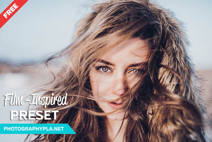
30. Film-Inspired Lightroom Preset
This Lightroom preset was made for you by PhotographyPlanet if you want a film-inspired look.
It can work perfectly with different kinds of photography. So you can also try it on your landscape, still-life images, and portraits.
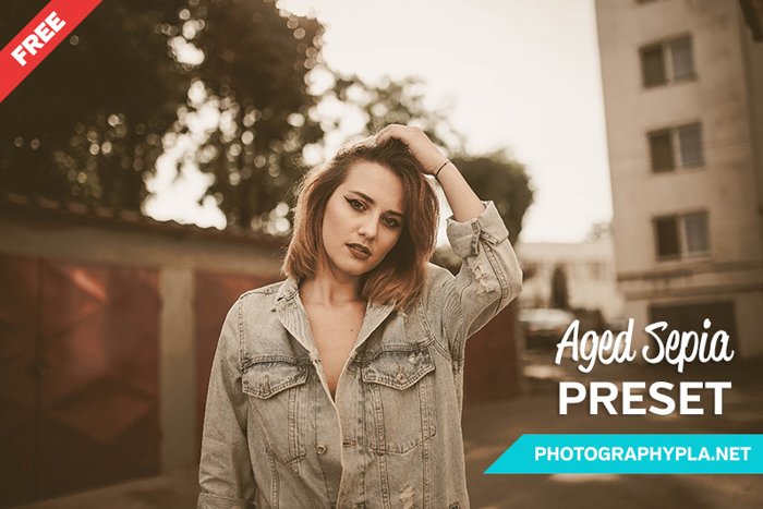
31. Vintage Film Lightroom Preset
Another free Lightroom preset from PhotographyPla.net. This one gives a vintage look to your image by adding a sepia-like look.
You can also try this for different genres.
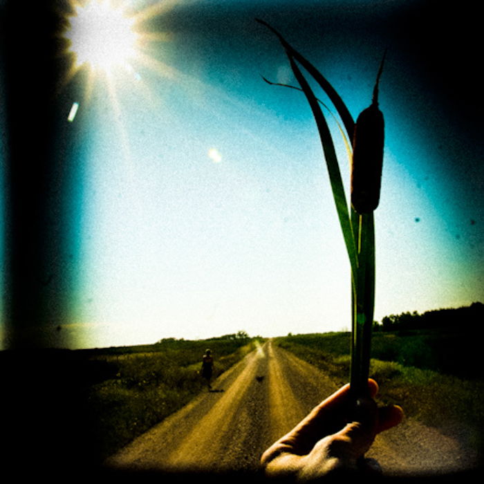
32. Holga Lightroom Presets
These 10 Lightroom presets by Dustin Leader on Preset Heaven are for mimicking the images a Holga camera takes.
These will strongly affect your photos, so you probably don’t want to use them all the time. But it’s definitely worth experimenting with them.
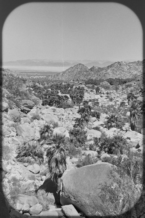
33. Historian
This free preset on Preset Heaven by Darya is a black-and-white one. This also has a strong effect but probably fits more images than the Holga presets.
It mimics an old film camera, and your images look like you were shooting on film.
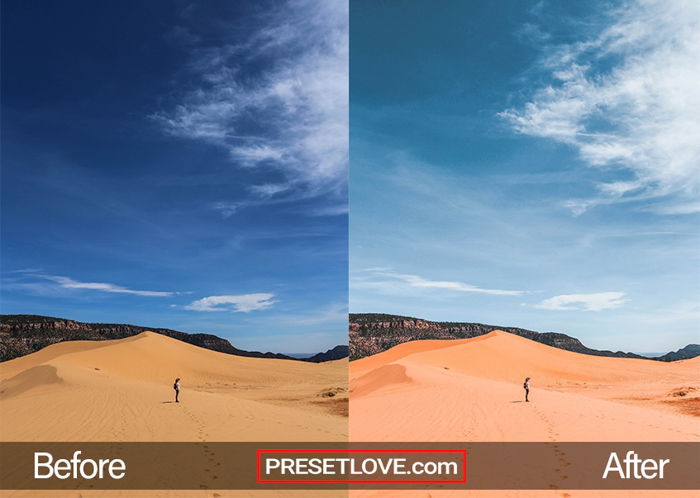
34. Desert Sun
This preset from PresetLove provides an easy way to draw out vivid and warm colors.
Looking at your images after, you can almost feel the heat of the desert.
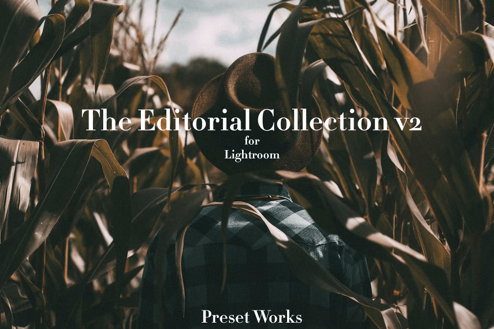
35. The Editorial Collection v2
These free Lightroom presets from Preset Works make your photos coherent and beautiful.
This collection contains 13 different presets. All of them give your images a deep and serious look.
36. VSCO film
VSCO created this preset to emulate the Kodak Ektacolor Pro 160. It’s a subtle difference in how it only adds contrast while pulling out a little clarity and vibrancy. It’s subtle yet effective.
Conclusion: Best Free Lightroom Presets
We have collected the best free Lightroom presets for almost every genre of photography. So you hopefully found something useful.
Feel free to experiment with modifying these presets. It’s a great way to practice and eventually create your own Lightroom presets. And check out our own Lightroom Presets if you want more simple, one-click presets for jaw-dropping edits!