If you want to improve your photography skills, consider shooting volcano photography. Volcanoes can be beautiful and deadly at the same time. And photographing them is a challenging but rewarding experience. Here are some tips on how to get started.
The Best Gear for Volcano Photography
You’ll no doubt have seen the image of a photographer standing on lava while his tripod and shoes catch fire.
The equipment you’ll need for this sort of photography must be durable. Let’s divide this list into sections.
You’ll need equipment for safety, transit, and taking photos.
Safety Gear
Volcanoes present a number of hazards. This is especially true if you intend to get close to a volcano or lava flow.
Certain items should be in every volcano photographer’s kit.
You don’t need these if you’re using a telephoto lens to photograph from a distance.
Note that none of these things will protect you against a pyroclastic flow.
- Helmet: One of the biggest dangers around volcanoes is falling rock (or lava bombs). Wearing a helmet will give you some degree of protection from these hazards.
- Gas Mask: There can be life-threatening gases around volcanoes. You need a gas mask to protect you against them.
- Heat-resistant Clothing: Getting close to the lava is risky business. You’ll do so at your own risk. Wearing heat-resistant clothing in such an environment is a good idea.
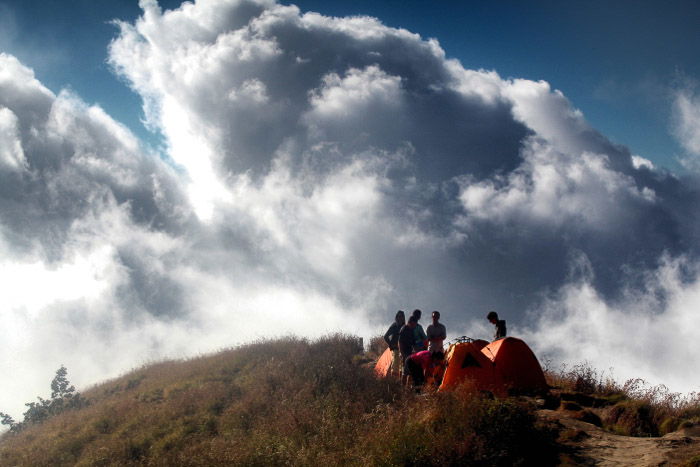
Hiking Gear to Get to the Volcano
Some volcanoes are in relatively accessible locations. For many of them, you’ll need to traverse extreme terrain to reach them.
That means in addition to taking the right safety equipment, you’ll also need the following.
- Hiking Boots: You’ll need a good pair of hiking boots to climb volcanoes. Volcanic scree is treacherous to walk on and will also drain your energy.
- Warm Clothing: You’ll still need warm clothing when climbing volcanoes in the tropics. Indonesia sits on the equator. And yet people climbing the volcanoes there have been known to die from hypothermia.
- Walking Poles: These will help give extra balance and make you less likely to slip.
- Rations: As with any serious hiking expedition, you’ll need enough food to last throughout your trip.
- Water Bottle: Enough water for your trip is essential, so bring water bottles and hydration bladders. Consider water purifiers as well if you’re hiking for several days.
- First Aid Kit: Plan for the unexpected. Bring a first aid kit with you.
- Tent and Sleeping Equipment: If your trip spans several days, you’ll need these. Ensure you’ll be warm if you’re going to a place where the temperature drops significantly at night.
Photography Equipment: Why It’s Last on Our List
Most photographers pack their photography gear first and then see how much space they have left. When photographing volcanoes, you should do the opposite.
Pack your photography gear last. And don’t compromise on the safety gear you’ll need.
These are the photography items you should take with you.
- Camera Body: A good solid camera capable of withstanding the extreme environment you’ll visit. A dust- and weather-sealed body is a must.
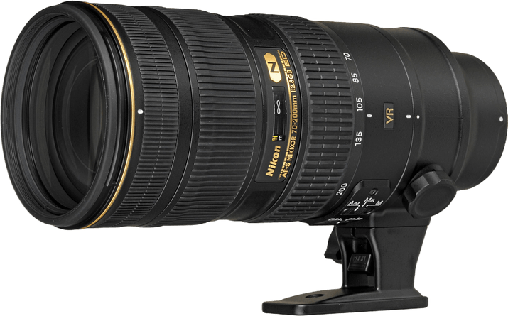
- Lens: For landscape photography, you’d usually bring a wide-angle lens. This is a good choice for dormant volcanoes. For active volcanoes, mid- and long-focal-length lenses are better. Think 24-105mm or 70-200mm. Choose your lens and mount it before you arrive. Don’t change it on-site to avoid dust getting onto your sensor.
- Tripod: This is vital for any landscape photography. This allows you to bracket your image, leading to better results. You’ll also need it for any evening and night lava photography you choose to do. Ensure the tripod is sturdy and capable of withstanding heat.
- Filter: A UV filter will protect the front of your lens. Ash from previous volcanic eruptions can get into the lens. A UV filter will offer protection from various debris found in volcanic areas.
- Camera Raincoat: The best way to protect your camera is to prevent it from getting dirty in the first place. Adding a layer of protection to it makes sense.
- Cleaning Equipment: Even with all the protection, your camera will still likely pick up some dust. Clean your camera after your shoot with a camera blower and microfiber cloth.
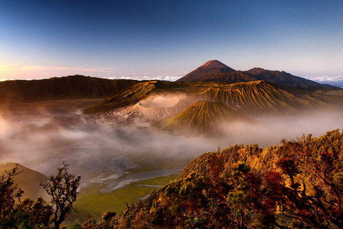
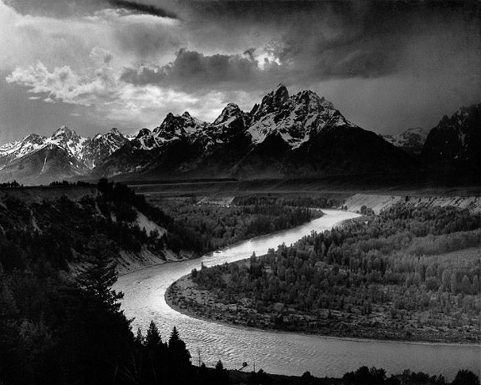
Where Are the Best Volcanoes to Photograph?
Volcanoes are usually found in the tectonically active areas of the world. The aptly named Ring of Fire is one of these zones. It contains most of the world’s volcanoes.
This area includes New Zealand, Indonesia, the Philippines, Japan, Kamchatka, Alaska, and the Western Seaboard of North and South America.
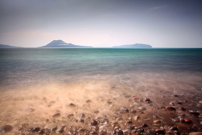
It’s not the only place where you can find volcanoes, though. There are volcanoes in Italy, Iceland, Hawaii, and a couple in Africa as well.
If you live near one of these locations, you can go local. If you’re looking for a country with many volcanoes, Indonesia is a good place to visit.
Check Your Volcano’s Eruption History Before Visiting
Is the volcano you’re planning to visit currently erupting? When was its last eruption? Does it have a history of small eruptions before a colossal one?
You’ll want to photograph an actual eruption. There are volcano activity websites you can check to watch what’s currently erupting or showing signs of unrest.
Why Eruption Types Are Important
Volcano eruptions are divided into a scale known as the volcanic explosivity index or VEI. This scale is divided into eight sections. Those volcanoes like the ones in Hawaii erupt continuously, with lots of lava.
The lava is, of course, dangerous. But these volcanoes are less dangerous than the stratovolcanoes, capable of much larger eruptions.
Depending on the volcano’s danger level, local authorities may put an exclusion zone around the volcano. It’s worth knowing and respecting this.
Volcano eruptions of level 5 and higher are potentially very dangerous but amazing to photograph. Be aware of pyroclastic flows and lahars.
You should be safe if you’re outside the exclusion zone.
Ask the Locals for Even More Information
Local knowledge is vital when it comes to photographing volcanoes. You’ll need to find as much information about the volcano as possible. You should also think about hiring a guide to take you up.
You’ll want to find out if the volcano produces dangerous pyroclastic flows. If so, ask in which direction they typically travel.
How to Find the Best Vantage Points
You’ll need to spend some time exploring any potential vantage points. Taking a local who knows the best viewpoints for the volcano will make this easier.
You’ll need to see these places yourself to decide whether they’d make good locations to take photos from. Be sure to decide on (and take with you!) the correct lens for each potential vantage point.
Watch the Lava and the Eruptions
Once you arrive at the site of an erupting volcano, you should always spend time watching the eruption from a safe distance. That’s because you need to see the eruption’s intensity and the lava’s direction.
After doing this, you’ll be able to approach the volcano more closely and find the best places for photography.
Approaching a volcanic eruption is very dangerous. It’s not advised that you approach larger eruptions.
A rating of VEI 2 and lower are eruptions you can consider getting closer to. The less violent, the better.
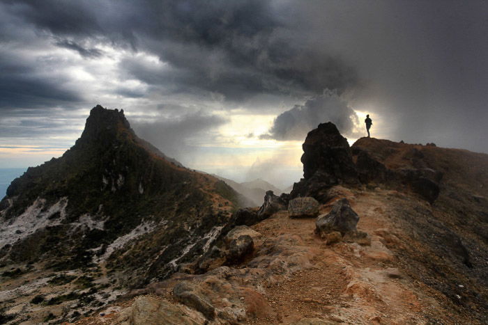
Why You Should Plan a Clear Escape Route
Volcano areas are dynamic and unpredictable. Things can change in a split second.
Traveling with at least one other photographer or a guide is a good idea. While taking photos, you won’t be completely aware of what’s around you. With a partner, the other person can watch the volcano in case of a sudden change of activity.
Lava Photography and Photographing Volcanoes
You’ve researched the volcano, hiked to it, and done everything possible to ensure your safety. Now you’re finally ready to photograph the volcano itself.
Photographing During the Day
Photographing volcanic eruptions during the day will allow you to capture the more explosive eruptions and their ash clouds.
It’s possible to do daytime lava photography as well. But evenings will give you more possibilities for this.
The lens you’re likely to be using is a 24-105mm lens. If you’re far away, you may need a longer lens.
With daytime photos, you can either look to freeze the action or allow for some motion blur.
- Freeze the Action: You’ll need a fast shutter speed. You’ll freeze falling lava bombs if you’re close to the volcano or pyroclastic flows photographed from a distance. Set your shutter speed to 1/1000 s and adjust your aperture and ISO accordingly. The ISO is likely to be 1000 or higher. For landscape photos, you’ll typically want an aperture of f/8. As it gets darker, you may need to use a larger aperture.
- Motion Blur: At the other end of the shutter speed spectrum are slower speeds and the ability to blur motion. You’ll need shutter speeds of at least 1/20 s to capture the suggestion of motion. Try to use this with ash clouds. You can capture lava movement with shutter speeds of one second or longer. Use an ISO of 100 and a smaller aperture for slower shutter speeds. If needed, add a graduated neutral density filter.
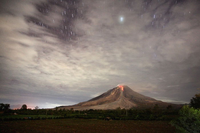
Photographing Volcanoes at Night
One of the best times to practice lava photography is at night. You’ll pick up the distinctive glow of the lava so much better.
Photographing during the late blue hour is the best time. You have a better chance of picking up foreground details of the volcano.
The later into the blue hour you go, the brighter the lava will appear in the photo. Once fully dark, the rocks will likely be black silhouettes against the lava.
This is why you should look to photograph during a full moon. Also, take a strong flashlight to light paint nearby rocks during the exposure.
To capture the lava bomb streaks as they erupt from the volcano, look to expose them for upwards of 10 seconds.
Post-Processing Lava and Volcano Photography
The usual steps for traditional landscape photography will also apply when photographing volcanoes. Photograph in RAW, and where possible, bracket your images.
I like to keep my editing subtle. This will ensure the photo is as close to what you see in real life as possible.
Photographing in RAW will allow you to deal with lava that’s been overexposed and appears yellow or white in your photo.
Reduce the highlights and ensure your lava has a red and orange gradation.
How to Protect Your Gear
In addition to all the precautions already mentioned in this article to protect yourself, you’ll also need to protect your gear.
Burning tripod legs and burning shoes might look amusing in viral photos, but I assure you, they’re not.
This is where having someone watching you is a good idea. In the unlikely event you catch on fire, they’ll be on hand to help you put the flames out.
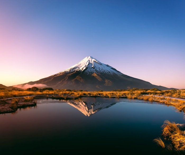
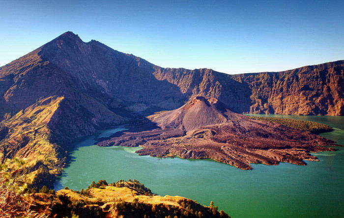
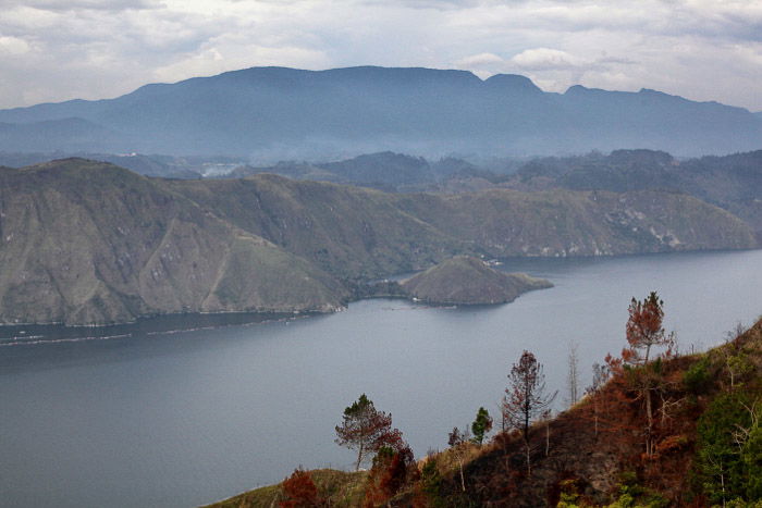
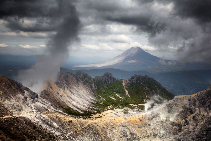
Photographing Dormant Volcanoes
Volcanoes are incredibly beautiful even when they’re not erupting. Features like crater lakes and harsh geology make them great subjects for photography.
Here are some other photography options for when the lava isn’t flowing.
- Hiking the Volcano: Climbing a volcano while it’s dormant is a worthwhile experience. You’ll still need to deal with volcanic scree, steep ravines, and escaping gas. There are safety hazards even when the volcano sits idle.
- Geysers: Nature’s natural fountains, these make great main subjects in a photo.
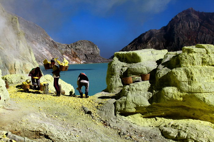
- Acid Lakes: When escaping sulfur gas mixes with a crater lake, you’ll get an acid lake. These lakes have an unusual, otherworldly feel to them. They’re very photogenic.
- Sulfur Mines: These aren’t as common as they once were, but sulfur can be mined from an active volcano. In Indonesia, this is a practice still carried out by some hardened men, one of the toughest jobs imaginable. This is a strong subject for photojournalism.
Conclusion: How to Shoot Volcano Photography
Approaching a volcano is always something you do at your own risk. This article only gives advice and doesn’t guarantee your safety. So it’s a high-risk situation with a high reward!
With that said, photographing volcanoes is a lot of fun. Use these tips to stay safe while taking some explosive pictures!