Desert photography can be some of the most rewarding and challenging types of photography there is. The wide-open spaces and constantly changing light can create some stunning images. But they can also be a challenge to capture well. Here are a few tips to help you get started.
How to Shoot Perfect Desert Photography Image
1. Preparing for Desert Photography: Tips for Surviving Harsh Desert Conditions
A safe and rewarding trip to the desert starts with careful preparation. The first thing is to choose the right time to visit based on your temperature tolerance.
Death Valley National Park is a popular desert location for landscape photographers. But it also holds the record as the hottest recorded temperature on the planet at 134 F (57 C).
The temperature is often in the very comfortable 70 F range (20 C) in January. So timing is essential when planning a visit to the desert.
Depending on the time of your visit, consider several items for safety and comfort:
- A hat to shield you from the sun
- Several bottles of water to stay hydrated
- Sunglasses and sunscreen
- A GPS (phones don’t work in many remote locations)
- A scarf to cover your neck
- A long sleeve shirt to block the sun
- Pants with zip-on-off leggings
- Quality hiking boots
2. Essential Gear for Desert Photography
Desert photography is similar to landscape photography. You have to pack only the equipment you are sure you will need.
This can include the following:
- Lenses ranging from wide-angle to telephoto
- A tripod
- Cable release
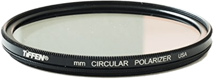
- Filters like a polarizer or graduated neutral density
- A focus loupe
- A flash unit if you want to add light
- Extra batteries
- Extra SD cards
- A multi-tool
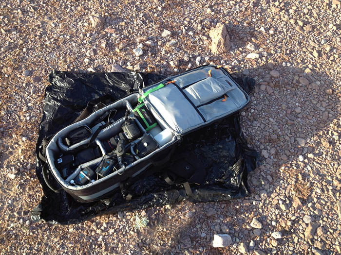
And make sure you have a garbage bag with you. Many desert plant species have adapted defensive mechanisms in the form of needles. In some locations, the ground is littered with them.
Camera care is important. And setting your bag on the ground or in the sand can create problems later. It is better to place it on the garbage bag.
We have a post on taking care of your camera when traveling abroad.
3. Choosing Lenses for Desert Photography
Wondering what lens you’ll need is a valid question. My opinion is, “Whatever you can carry.” If you need to keep weight in check, limit your lens choice to fewer lenses with greater coverage.
I carry a 16-35mm lens, 28-70mm, and 80-200mm as my three main lenses. And I use them all.
The desert landscape consists of endless sand and sky. It’s natural to want to capture it all in one frame with a wide-angle lens. While there are plenty of subjects where this lens is a perfect choice, consider using a telephoto lens.
Remember, a wide-angle lens makes the foreground appear larger. A telephoto brings the distant background closer to the viewer by zooming in.
I captured the photo below at Badwater in Death Valley. The wide-angle lens emphasizes the foreground while minimizing the background. This is an excellent strategy for scenes with interesting foregrounds and dull backgrounds.
A telephoto lens is also valuable when you observe a subject far away. Here, the foreground is not interesting, so it’s best left out while zooming in on a specific area.
Captured in Death Valley, this detailed shot of distant hills required a 300mm lens. It was the best way to get close enough and leave out the surroundings.
4. Use Classic Composition Methods to Add Depth and Interest
The desert landscape is rich with subjects to photograph. But if you are new to these dry, desolate locations, finding a great subject and composition may take some time.
Recall the most common composition strategies in landscape photography. You can find the same ones in the desert as well.
Look for leading lines, curves, patterns, textures, objects, framing, forced perspective, and one-third placement. If you remember these, you will find a worthy subject quickly.
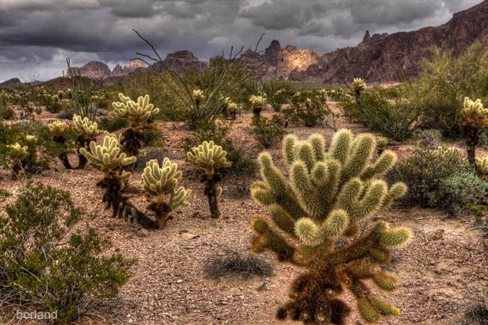
I composed this scene using the rule of thirds. I placed this large Cholla Cactus in a foreground one-third “hot spot.” The close subject and distant background give a sense of depth to the scene.
Foreground lines are a powerful way to lead the viewers into a scene. It’s a natural response to start looking at the scene at what appears closest to the camera and then follow it through to the background.
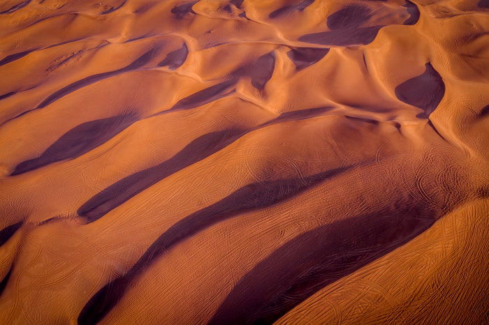
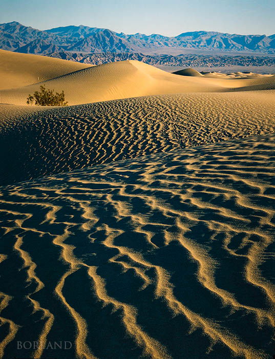
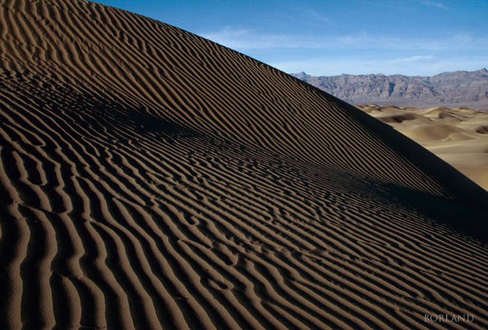
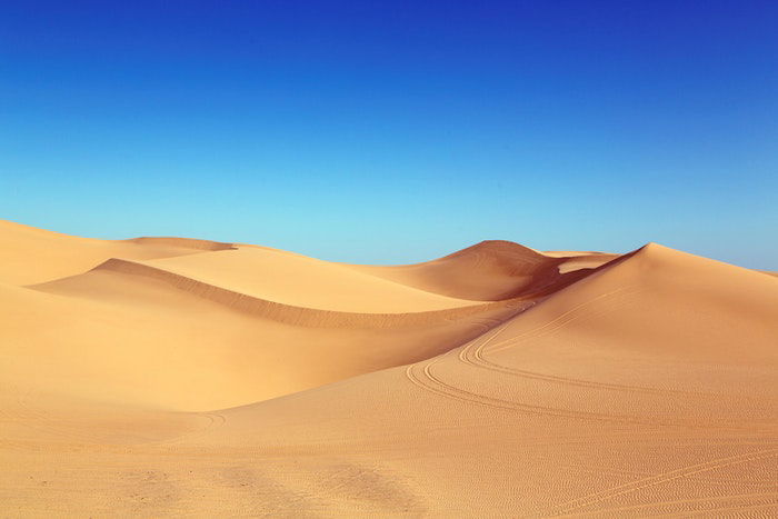
The picture below has layers with different tonal values and textures. They flow from foreground to background. The lines lead our eyes to the sand dunes and the mountains in the background.
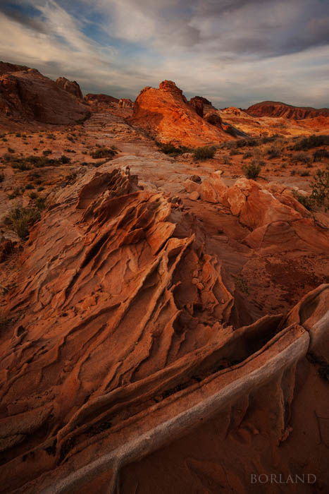
Diagonal lines, or the Z lines, are another powerful composition approach. Check out the photo below.
The foreground lines create a Z-line. It zigs and zags through the picture on its way toward the background.
5. Include Natural Patterns for Unique Desert Images
Desert landscape photography often presents new subject opportunities to landscape photographers.
Look for cacti and unique geology. You can find a variety of colorful rocks and unusual patterns.
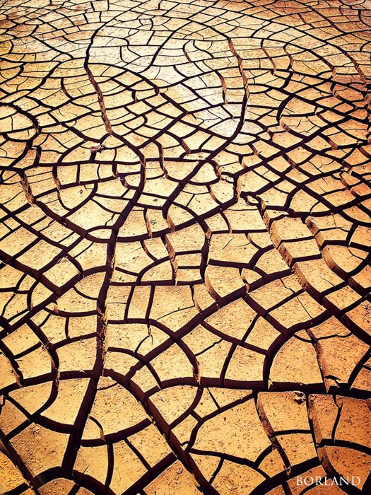
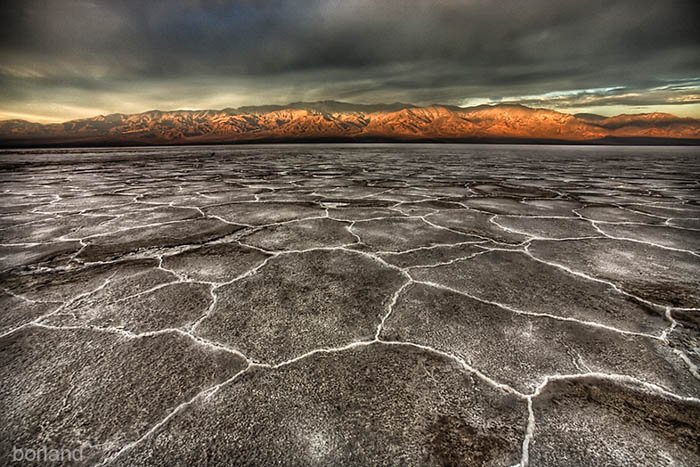
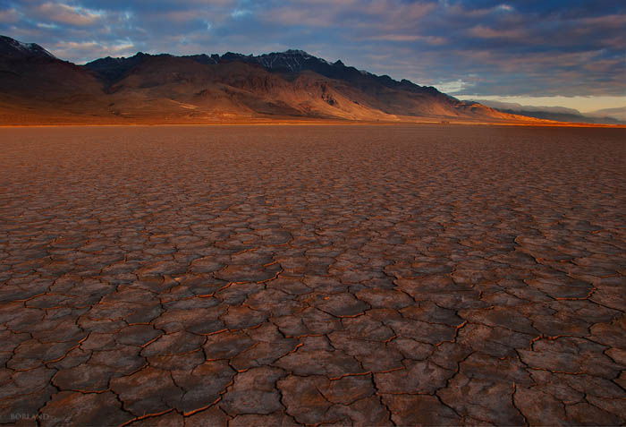
This image of cracked mud is a great example of patterns. The water evaporated, and the sediment hardened. Then it cracked as it dried out. The result is amazing patterns and textures that you can zoom in on.
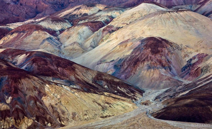
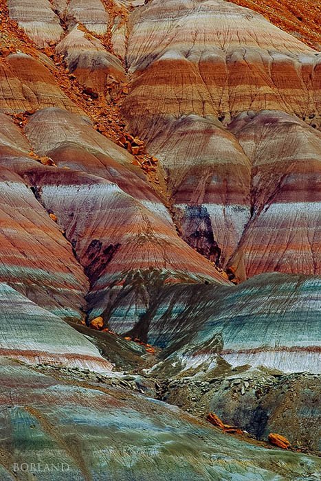
Not all patterns and textures are on the ground. This eroding hillside has beautiful layers. I used my 70-200mm zoom lens for this photo. This let me zoom in and out and create a composition emphasizing the horizontal rows.
Like leading lines, patterns can create an excellent balance in photos. Shot with a 35mm lens, this foreground occupies two-thirds of the composition and leads to the mountain on the horizon.
The camera height controls how prominent the foreground will be. In the picture below, the height is moderate. It does not emphasize the foreground too much or too little.
6. Use Low-Angle Lighting From the Sun to Show Texture
Some say that desert light is some of the best you find in landscape photography. The advantage of visiting in winter is shorter days and the sun’s position, which is low most of the day.
That low angle can create great lighting early and late. Sometimes even throughout the day.
It was barely mid-afternoon when I captured this sand dune image. You can see by the lighting in the background that there are few shadows. It might be hours before the sunset-quality lighting. Yet, this image has perfect lighting on the dune right now.
Here is why:
- The sun on the left creates beautiful side lighting, emphasizing the texture.
- The angle of the sun is low in the sky. So the foreground sand ripples have close to 40% highlight and 60% shadow.
- The angle of the dune is sloping downwards to the right, away from the sun. It is beginning to fall into shadow, resulting in a darker-toned dune.
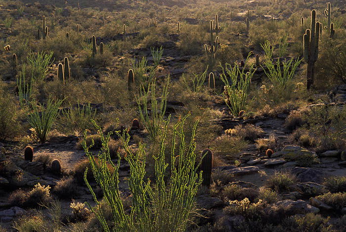
Backlighting is beautiful when applied to the right scene. In desert landscapes, you often find a variety of cacti and other plants that look amazing when the sun is lighting them from behind.
The needles and small leaves begin to glow as the sun gets closer to the horizon, making the plants stand out.
7. Take Photos After Sunset for Stunning Silhouettes
Once the sun sets, don’t put the camera away! There are still plenty of desert photos to capture. Silhouettes are one subject you can pursue as soon as the sun disappears.
Any subject that has a clear sky background will work.
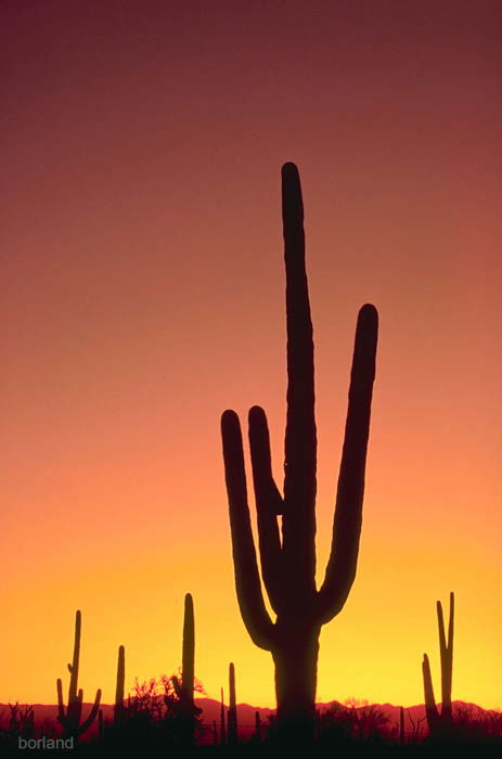
This Saguaro cactus in silhouette emphasizes the shape of the cactus. Plus, it is a symbol of the American Southwest. This is a great example of an excellent storytelling strategy for desert photography.
To get the perfect exposure for a silhouette, leave the subject out of the frame while you set the meter. This approach measures only the sky and helps ensure that the subject itself has no details.
A silhouette should be black. Start by aiming the camera to one side of the subject and let the meter read only the sky. Set the exposure for that, then reframe and shoot.
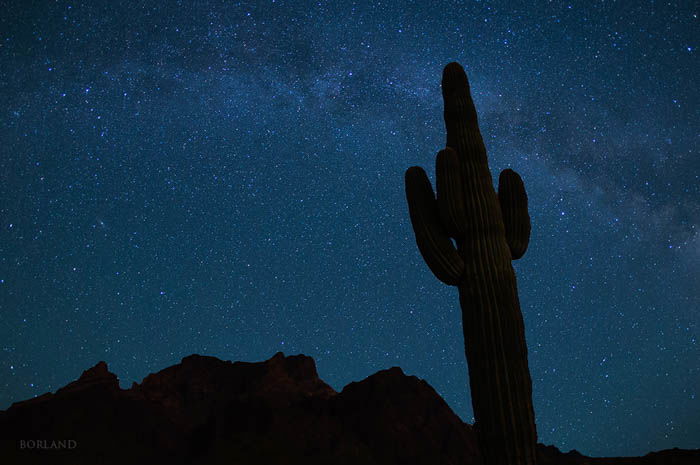
8. Capture the Night Sky in the Desert for Unique Images
The night sky is the last event of the day for desert photography. Since the sky is the light source, it’s another opportunity for silhouettes.
To photograph the night sky, you need:
- A full-frame camera. A crop sensor will also work but will show less coverage with the same lens.
- A tripod to hold the camera steady for long exposures.
- A wide-angle lens (I use my 16-35mm zoom).
- A cable release, so you don’t have to touch the camera.
The ISO you choose depends on your camera and lens’ maximum aperture. A good starting point is ISO 1600, 15-30 seconds, at f/2.8. But if your lens is not that fast and has a maximum aperture of f/4, then the best solution is to double your ISO to 3200.
Many DSLRs have a maximum shutter speed of 30 seconds. Then you need to switch to Bulb mode for longer exposures.
Longer exposures using Bulb mode will work well. But the stars begin to blur at longer shutter speeds. Keeping the shutter speed shorter (15-30 seconds) prevents blur. To get the needed increase in exposure sensitivity, upping the ISO helps.
Check out my photo below. The Saguaro cactus is a perfect subject, clearly outlined against the sky and mountains.
How to Make the Most of Your Desert Photography Trip
When you plan a desert photography adventure, consider these factors before you hit the road:
- What time of year is it? Will the temperatures be right for your comfort zone?
- Start with basic camera settings. ISO 100 for normal desert landscapes and increase ISO only when needed.
- Isolate (minimum aperture) or illustrate (maximum aperture) your subject depending on the story you want to tell.
- Are you planning on photographing desert wildflowers? You can expect a good wildflower display if winter storms have delivered a lot of rain. Before your trip, search for desert wildflower websites. They share up-to-date information on wildflower areas.
- What’s the ? Normal weather is good. But desert storms often include sandstorms, and you don’t want to be in one of those.
You may find pristine conditions if you can get out the day after a storm. The winds during storms will re-sculpt the sand dunes and create fresh patterns without footprints and tracks.
Conclusion: How to Shoot Perfect Desert Photography Images
Desert photography is a wonderful way to capture the magic desert landscapes offer. You can enjoy a safe and rewarding desert photography adventure with some pre-planning, good timing, and minimal gear!
We have the perfect course for you if you want to capture breathtaking landscapes! Try Simply Stunning Landscapes today!